KIOTI
Please enter the
Series or model name
Keyword
Brand Guideline
It’s time for this puppy to shine
Yes, our KIOTI logo is an impactful badge. But it's more than that. It's a symbol of who we are as a company, what we stand for, and what we offer to our customers. And if that symbol isn't consistent across all of our marketing materials, well, then we're just digging ourselves into a proverbial hole.
That's where logo guidelines come in. They lay out the rules for how our logo should be used, from the colors and fonts to the size and placement. And by following these guidelines, we can ensure that our badge is always presented in a way that's professional, recognizable, and true to our brand.
How to use our logos
We know you might be thinking we've got an abundance of logos but, spoiler alert: They're all just tweaked versions of our main badge. Feeling lost on which one to use? The following pages can serve as a nifty little guide that'll point you in the right direction when it comes to use cases.

Where it shows up
In context
How it shows up
Full color

Where it shows up
Out of context
How it shows up
Full color
Where it shows up
In context
How it shows up
1-2 color
Where it shows up
Out of context
How it shows up
1-2 color
Badge
The logo we got here is the real deal. It's succinct, it's compact, and it represents everything our brand is about.
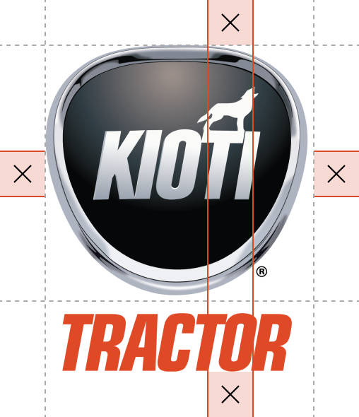
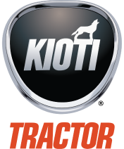
Our secondary logo has our badge with the “tractor” underneath it. Because, well, we make tractors. This mark should only be used in instances where we show up unexpectedly or without context — like when we don’t show our actual tractors or when we branch outside of the dirt community (e.g., sponsoring hockey games, curling games, etc.).
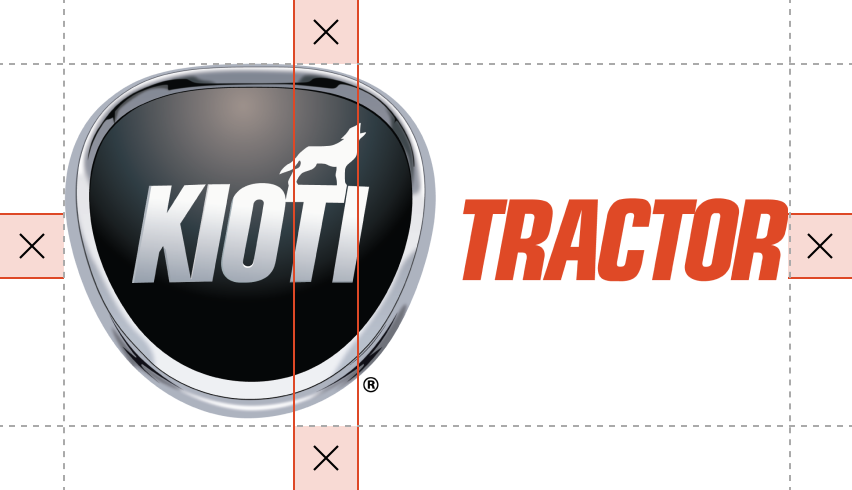
The horizontal badge lockup should be reserved for short & wide placements, such as digital media and video. Let’s not get crazy and start putting it everywhere, OK? Show some respect for the lockup, and it'll treat you right.
Background Colours
When combining the logo with brand colors, always ensure there is ample contrast in color pairings. The following examples are approved combinations. Note: must use logo with white registration mark on dark backgrounds.


Placement
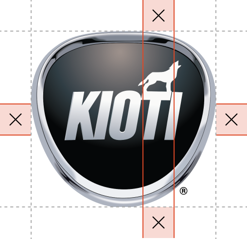
All variations of the badge should appear a safe distance from any other elements in the composition and only appear in the aforementioned variations. Because everyone deserves a lil personal space — even badges.
The distance, illustrated below, is measured by the distance from the base of the T to the base of the I. This measurement should remain consistent across all variations of the mark.
Size
We’ve got a minimum size for our badge, and there's a very good reason for it. If we don't, people aren’t gonna be able to read the thing — and we can't have that. So let's do it right and make sure our badge always shines, no matter where it's placed.
This badge should never appear smaller than 100px wide on digital or 30mm in print.
PS. in instances where the badge gets smaller than this, use the wordmark.
30 MM WIDE MINIMUM
DIGITAL
100 PX WIDE MINIMUM
30 MM WIDE MINIMUM
DIGITAL
100 PX WIDE MINIMUM
Colour Pallette
Our color palette is as bold as the day is long, just like the powerful machines we produce.
That's why our primary color is a bright, recognizable KIOTI orange that'll make your engine purrrrrrr. Always use the orange as an accent color — don’t go overboard, just use enough to catch the eye. And don't forget about black and silver — we use them to ground our brand and make sure our signature orange and kickass imagery really pop everywhere they show up.
KIOTI Orange
CMYK
0 / 82 / 100 / 0
RGB
222 / 72 / 38
HEX
#DE4826
PMS
1665 C
White
CMYK
0 / 0 / 0 / 100
RGB
255 / 255 / 255
HEX
#FFFFFF
PMS
Bright White
KIOTI Black
CMYK
0 / 0 / 0 / 100
RGB
35 / 31 / 32
HEX
#2D2926
PMS
BLACK C
KIOTI Silver
CMYK
45 / 34 / 34 / 0
RGB
138 / 141 / 143
HEX
#8D9093
PMS
877 C
